AI Prompt
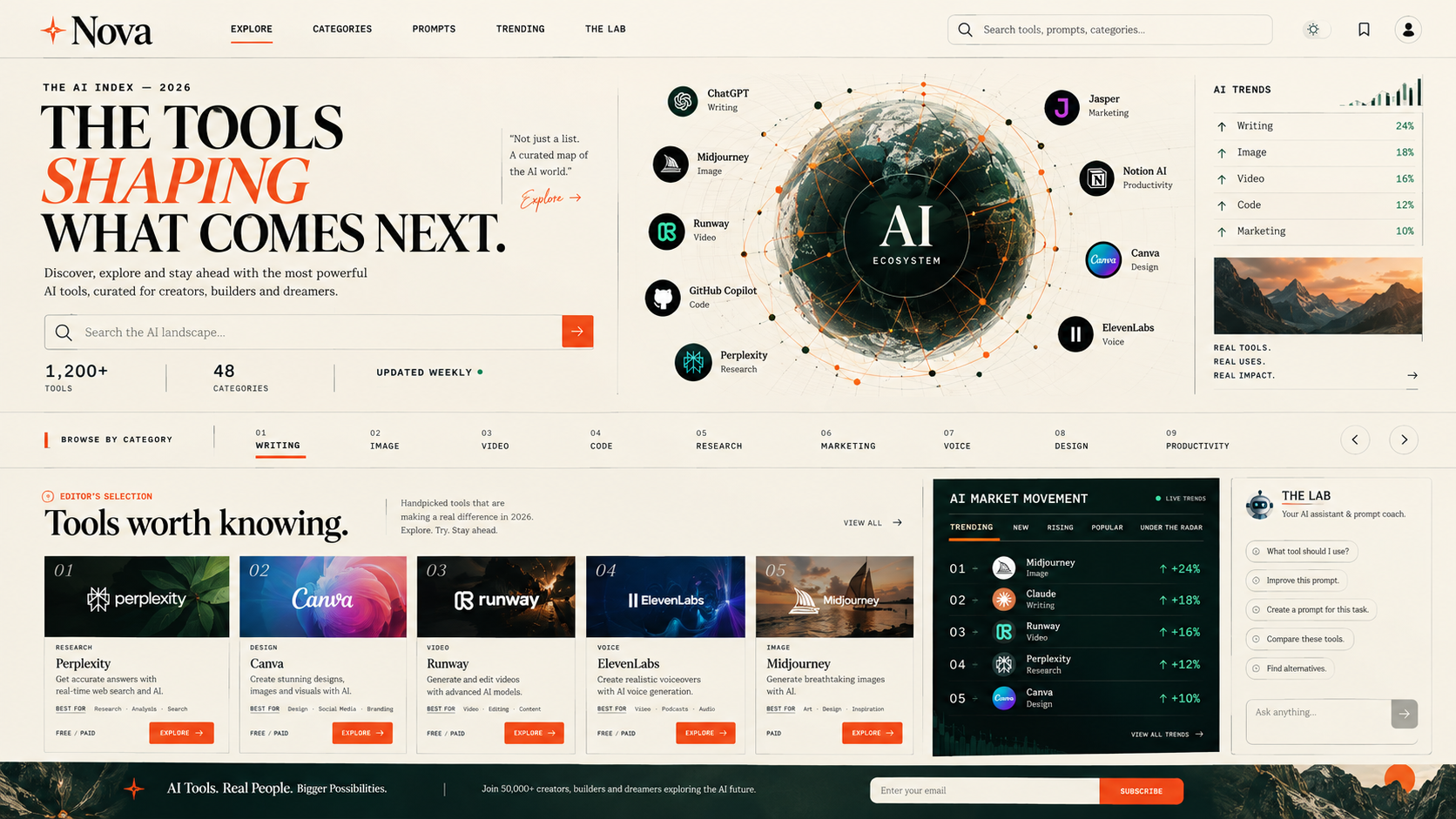
Basic website creation from just one prompt
Redesign the entire website from scratch with a completely original visual concept. The goal is to create a website that feels like it was designed by a highly
Redesign the entire website from scratch with a completely original visual concept.
The goal is to create a website that feels like it was designed by a highly creative human art director—not generated from a typical AI website template.
CORE DESIGN DIRECTION
Do NOT use the common "AI SaaS website" aesthetic.
Avoid:
- Purple/blue/cyan gradient backgrounds
- Glassmorphism
- Excessive rounded cards
- Floating gradient blobs
- Generic glowing effects
- Huge centered headline + CTA hero
- Repetitive 3-column card grids
- Generic dashboard layouts
- Excessive shadows
- Neon borders
- AI robot illustrations
- Floating abstract 3D shapes
- Stock AI-looking illustrations
- Excessive pill-shaped buttons
- Overused Inter-style generic SaaS typography
- "Powerful AI tools for everyone" type copy
- Template-like sections that look copied from other AI websites
The website should immediately feel different when someone opens it.
NEW VISUAL CONCEPT
Create the website as a combination of:
EDITORIAL MAGAZINE + DIGITAL PRODUCT CATALOG + CREATIVE TECHNOLOGY LAB.
Think of a premium technology magazine redesigned as an interactive digital marketplace.
The interface should feel:
- sophisticated
- editorial
- experimental
- premium
- intelligent
- slightly unconventional
- highly usable
- memorable
It should have its own visual identity rather than following current SaaS trends.
COLOR SYSTEM
Use a restrained color palette.
Primary:
- Warm off-white / ivory background
- Deep charcoal typography
- One distinctive accent color such as burnt orange, electric lime, cobalt, or deep red
Do NOT use gradients as the main visual identity.
Use color strategically for:
- buttons
- active states
- category indicators
- important statistics
- interactive elements
Large areas should remain clean and editorial.
TYPOGRAPHY
Use a strong typographic hierarchy.
Combine:
- A distinctive editorial serif for major headlines
- A clean modern sans-serif for interface text
Large headlines should feel like magazine headlines rather than SaaS marketing copy.
Use typography as a major visual element.
Create interesting combinations of:
- oversized typography
- small uppercase labels
- thin dividers
- numbers
- metadata
- short descriptions
HOMEPAGE
Do NOT create the standard hero section.
Instead, create an immersive opening composition.
At the top:
Small label:
"THE AI INDEX — 2026"
Large editorial headline:
"THE TOOLS
SHAPING
WHAT COMES NEXT."
Place a short description beside or underneath it.
Add a distinctive search interface that feels like an archive/catalog search rather than a normal SaaS search bar.
Example:
"Search the AI landscape..."
Below it, show live-style metadata:
1,200+ TOOLS
48 CATEGORIES
UPDATED WEEKLY
Use asymmetrical composition rather than everything being perfectly centered.
HERO VISUAL
Instead of an AI robot or abstract gradient illustration, create an interactive visual representing the AI ecosystem.
For example:
A large editorial-style "AI map" containing:
- tool names
- category labels
- small symbols
- connections
- rankings
- trends
It should look like a combination of:
- technology research poster
- stock market terminal
- magazine infographic
Keep it sophisticated and readable.
CATEGORY NAVIGATION
Do not use boring rectangular category cards.
Create a horizontal category index similar to a magazine index.
Example:
01 WRITING
02 IMAGE
03 VIDEO
04 CODE
05 RESEARCH
06 MARKETING
07 VOICE
08 DESIGN
09 PRODUCTIVITY
When hovering over a category:
- typography changes
- subtle motion appears
- related tools preview
- category number becomes highlighted
Make navigation feel tactile and editorial.
TOOL DISCOVERY
Do not display tools as a basic grid of identical cards.
Create a dynamic catalog.
Each tool should look like an editorial listing.
Example:
01
PERPLEXITY
AI RESEARCH
Short description
BEST FOR
Research · Search · Analysis
PRICE
FREE / PAID
[EXPLORE]
Use different visual layouts depending on the section.
Some tools can appear as:
- horizontal rows
- featured large entries
- compact lists
- comparison panels
- editorial recommendations
This creates visual rhythm.
FEATURED TOOLS
Create a large "Editor's Selection" section.
Instead of:
"Popular AI Tools"
Use:
EDITOR'S SELECTION
Tools worth knowing.
Show 3–5 carefully selected tools with large typography and distinctive visual compositions.
Each tool should have:
- number
- name
- category
- short editorial description
- use case
- pricing
- explore button
TRENDING SECTION
Create a section inspired by a financial market terminal.
Title:
"AI MARKET MOVEMENT"
Show tools with:
↑ TRENDING
NEW
RISING
POPULAR
UNDER THE RADAR
Include subtle animated indicators.
For example:
01
TOOL NAME
+24% INTEREST
02
TOOL NAME
+18% INTEREST
Do not make fake claims about real statistics. If the numbers are not real, clearly label them as UI examples or connect them to actual admin-controlled data.
TOOL DETAIL PAGE
Completely redesign the traditional SaaS product page.
The page should resemble an editorial research profile.
Top:
TOOL #034
TOOL NAME
CATEGORY
Short editorial introduction.
Then sections:
WHY IT MATTERS
WHAT IT DOES
BEST FOR
KEY FEATURES
PRICING
ALTERNATIVES
USER RATING
RELATED TOOLS
Use typography, lines and spacing rather than lots of cards.
Include a prominent:
"OPEN TOOL"
button.
PROMPT MARKETPLACE
Give prompts their own unique experience.
Do not show prompts as ordinary cards.
Create a "Prompt Archive".
Each prompt should have:
PROMPT #0184
TITLE
CATEGORY
USE CASE
DIFFICULTY
MODEL
Then show the actual prompt inside a beautiful reading interface.
Include:
- Copy button
- Like
- Save
- Remix
- Improve Prompt
- Report
The prompt should feel like an asset being collected, not just a piece of text inside a card.
AI ASSISTANT
Do not create a generic chatbot bubble in the bottom-right corner.
Give the AI Assistant a dedicated identity.
Call it something distinctive such as:
"THE LAB"
or
"PROMPT LAB"
Users can ask:
"What tool should I use?"
"Improve this prompt."
"Create a prompt for this task."
"Compare these tools."
"Find alternatives."
The assistant interface should feel like entering a research laboratory rather than opening another ChatGPT clone.
MICRO-INTERACTIONS
Use subtle interactions throughout the website.
Examples:
- numbers animate when entering viewport
- category index responds to hover
- tool rows expand
- typography shifts slightly
- underline animations
- cursor interactions
- smooth page transitions
- subtle horizontal movement
- editorial reveal animations
Avoid excessive animation.
The website should feel fast and premium.
RESPONSIVE DESIGN
The mobile version must NOT simply be a compressed desktop version.
Design mobile intentionally.
Use:
- large typography
- horizontal scrolling indexes
- swipeable tool collections
- compact metadata
- sticky navigation
- simple interaction patterns
Make mobile feel like an editorial mobile app.
NAVIGATION
Create a distinctive navigation system.
Desktop:
LOGO | EXPLORE | CATEGORIES | PROMPTS | TRENDING | THE LAB | SEARCH
Keep it minimal.
On scroll, transform the navigation subtly into a compact sticky bar.
VISUAL DETAILS
Use:
- thin rules
- editorial numbering
- oversized typography
- asymmetric layouts
- whitespace
- subtle textures
- tiny metadata labels
- intentional imperfections
- carefully controlled motion
Avoid making everything symmetrical.
The design should have visual tension and personality.
BRAND PERSONALITY
The website should communicate:
"We don't simply list AI tools.
We curate the AI landscape."
It should feel like a destination people want to explore.
Not another directory.
Not another AI SaaS dashboard.
Not another template.
IMPORTANT DEVELOPMENT RULE
Build the website from scratch.
Do not imitate existing AI marketplaces.
Do not use generic AI-generated UI patterns.
Every major section should have a distinct visual purpose.
Prioritize:
1. Originality
2. Usability
3. Strong typography
4. Information architecture
5. Visual storytelling
6. Fast performance
7. Responsive design
The final result should make someone think:
"I haven't seen an AI tools website designed like this before."
Before coding, establish the complete visual system, component hierarchy, spacing system, typography system, color system, navigation behavior, and responsive behavior.
Then implement the website consistently across every page.
Do not change existing functionality unless necessary for the redesign.
Preserve existing data, search, categories, tools, prompts, admin functionality, authentication, likes, saves, and AI assistant functionality.
The redesign should primarily change the EXPERIENCE, VISUAL LANGUAGE, INFORMATION ARCHITECTURE, and INTERACTION DESIGN.
Published: 2026-09-19